When decorating your short-term rental, choosing the right colors is crucial. The wrong color scheme can turn off potential guests and make your rental feel less inviting. On the other hand, the perfect color palette can create a warm and welcoming atmosphere that will make your rental stand out from the competition and bring in more bookings.
So, how do you choose the right color scheme for your short-term rental? Below are a few tips to help you get started.
Consider Your Target Market
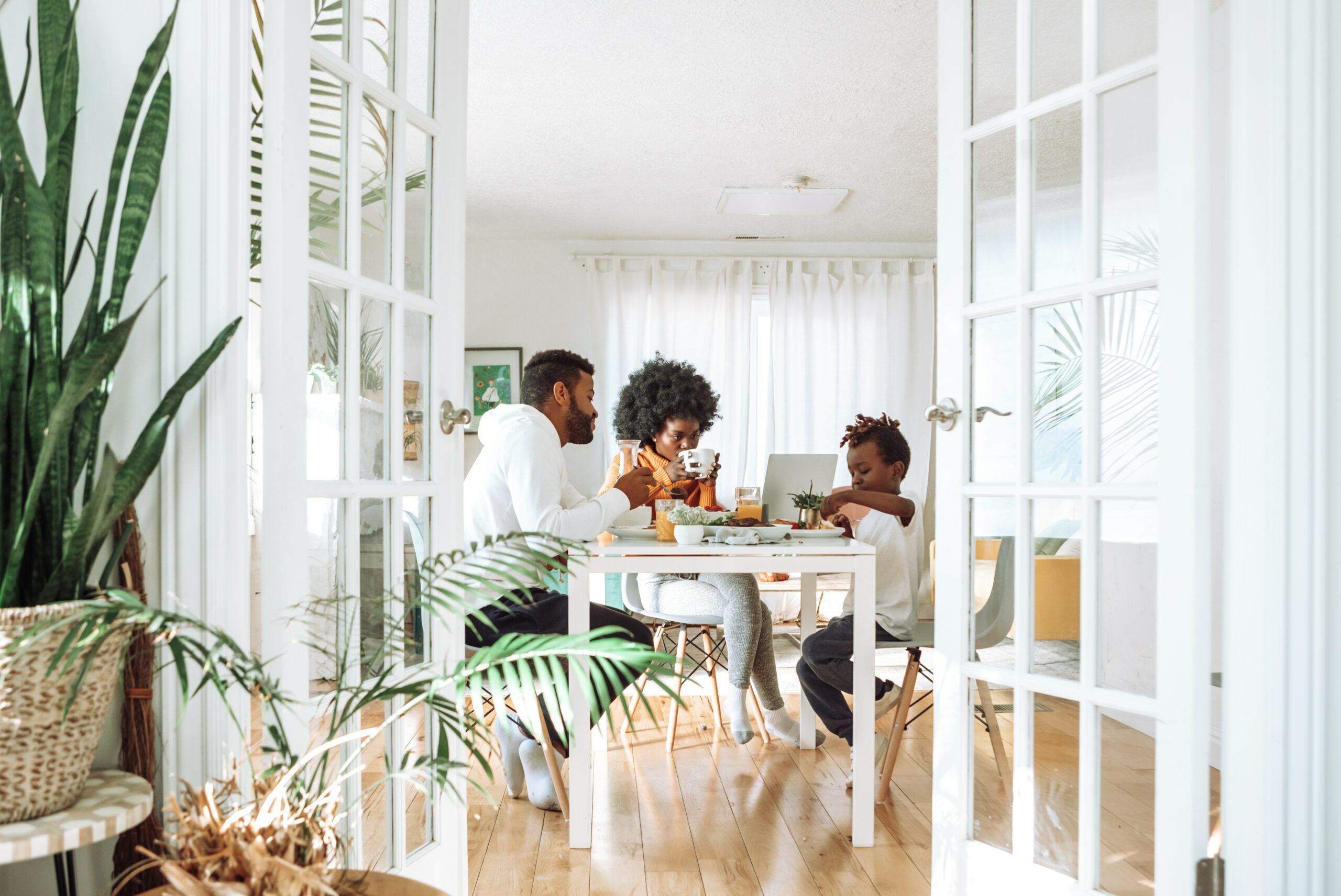
When choosing paint colors for your rental, it’s important to consider your target audience. Are you trying to appeal to families with small children? Business travelers? Couples looking for a romantic getaway? Once you know who you’re trying to attract, you can start narrowing down your color choices.
For example, if you’re hoping to attract business travelers, you’ll want to stick with more neutral tones like gray or beige. These colors create a sense of calm and professional feeling that will be perfect for busy travelers who want to relax after a long day of meetings or conferences.
On the other hand, if you’re looking to appeal to families with small children, brighter colors may be the way to go. Cheerful yellows and light greens create a warm and inviting atmosphere that kids will love. And since families often look for value when booking vacation rentals, stick with budget-friendly options like semi-gloss or high-gloss latex paints that are easy to clean in case of spills or accidents.
Follow the 60/30/10 Rule
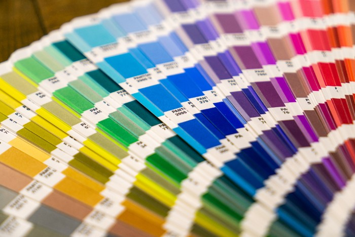
In order to create a successful color scheme, it’s important to follow the 60/30/10 rule. This rule states that you should use one main color for about 60% of the room, a secondary color for around 30%, and an accent color for the remaining 10%. For example, if your primary color is white, you could choose a light gray for the secondary color and a dark blue for the accent color. This will help create visual interest in your space while allowing each color to play off one another. Additionally, it’s important to use varying shades of each color – this can be achieved by using lighter and darker hues within the same tone. By following the 60/30/10 rule and choosing colors that reflect your target, you’ll be sure to create a beautiful and inviting atmosphere that will make your rental stand out from the competition.
Plan Your Color Palette
Once you’ve identified your target market and narrowed down your color choices, it’s time to plan out a color palette. Use a color wheel for reference, and start by picking out two or three shades that will serve as the main colors in your space. When you’re deciding on a palette, try to choose colors that will complement each other and create a sense of balance in the space. Additionally, consider selecting colors that reflect the local area or climate – this can help give your short-term rental property a unique look and make guests feel like they are truly experiencing the destination at its best.
Finally, be sure to shop around for the best deals on paint. Look for discounts and sales at local stores, or take advantage of online retailers’ free shipping offers. There are plenty of ways to save money on paint without sacrificing quality – keep your target audience in mind while shopping.
Use Neutral Colors As A Base
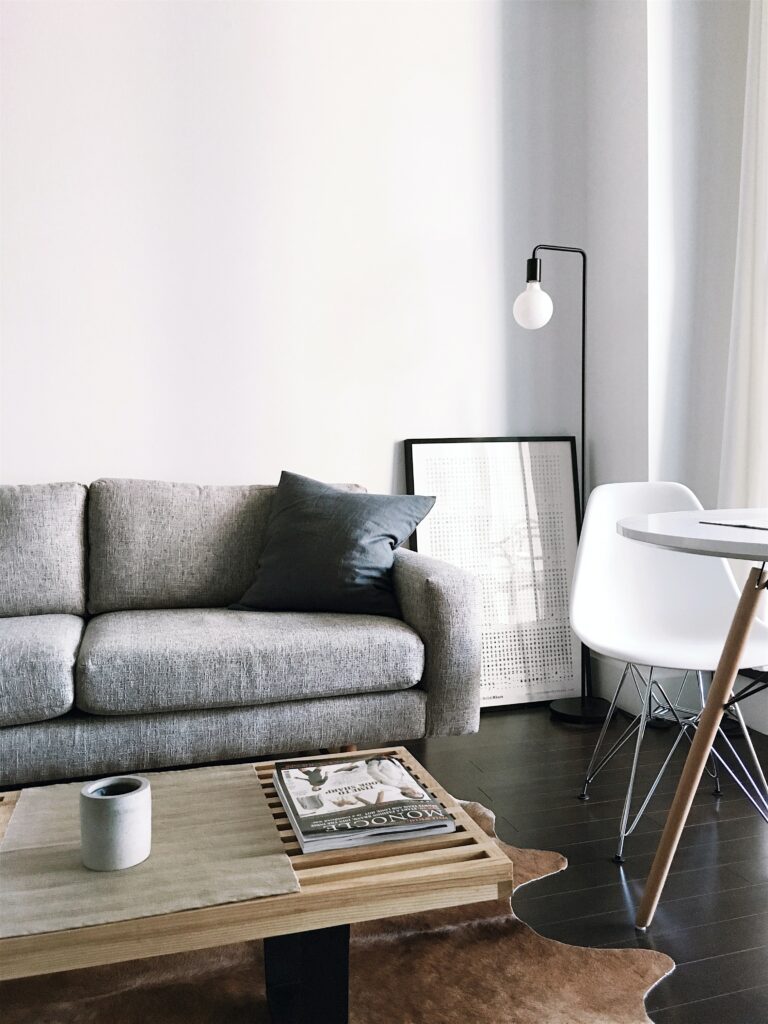
Neutral colors are always a good choice if you don’t plan to change the paint color of your walls. Neutral tones like white, gray, and beige can easily match any style. They also create a calm that will help with relaxation during vacation. Additionally, these hues are usually budget-friendly when compared to brighter color choices. This makes them ideal for short-term rental properties since they won’t require a lot of maintenance or upkeep. Finally, neutrals provide the perfect base to add pops of color with accessories like bedding, pillows, and artwork which can help you create a unique atmosphere. With their versatility and timeless appeal, neutral colors are perfect for any short-term rental property.
Incorporate Accent Colors
Accent colors can add personality and pops of color that will make your rental feel more inviting. When choosing accent colors, it’s important not to go too overboard—stick to one or two accent colors so as not to overwhelm potential guests. A great way to do this is by using a paint color wheel. This will help you choose colors that complement each other and create a cohesive look throughout your rental property. Some good accent color options include green, blue, yellow, orange, and red. For a softer, subtle palette, consider adding light blues, pinks, oranges, or purples.
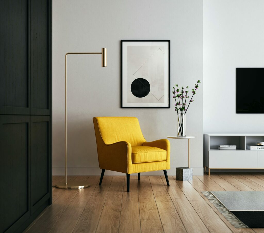
Creating a great first impression with furniture
Fishing touches like furniture can play a big role in creating an inviting atmosphere and making your rental stand out from the competition. Start by selecting comfortable and stylish furniture to help set positive expectations for your guests. When shopping, look for durable pieces that still reflect the style of your rental property. Additionally, opt for multi-functional pieces to maximize space, like convertible sofas and ottomans that can be used for extra seating. Finally, choose accent pieces like throw pillows and rugs in colors that match your overall color palette. This will help tie the space together and create a warm and inviting atmosphere for guests.
Final Thoughts
In conclusion, choosing the right colors for your short-term rental can make a world of difference in how appealing it is to potential guests. When selecting paint colors, consider who you’re targeting and keep your overall color palette neutral with pops of accent color. Following these tips will help create a warm and inviting atmosphere that will make your rental stand out from the competition and give your guests an unforgettable experience.
Read more: How to Choose the Right Color Scheme for Your Short-Term RentalRead More Related Posts
“Vacation Rental Decorating Ideas: Decorate Like A Pro“
“Discover The Best Vacation Home Amenities To Make Your Guest Feel at Home“
